Red bull google slides template stunning pitch deck tips
If you want a pitch deck that hits like a can opening — immediate, bold, and impossible to ignore — a red bull google slides template gives you the visual energy to match a high-octane idea. This article walks you through an up-to-date, human-first approach to building a Red Bull–inspired Google Slides deck: where to find ready-made templates, which colors and fonts reproduce that energetic vibe without breaking brand rules, how to craft each slide so your story breathes, and simple production tips to keep your deck professional whether you present on a projector or send a PDF.
Why choose red bull google slides template?
A red bull google slides template is all about attitude: strong contrasts, energetic colors, and big, punchy headlines. That look works especially well for sports sponsorships, event proposals, lifestyle brand pitches, and product launches where momentum matters. Rather than copying logos or trademarks, aim to borrow the mood — vivid reds, striking yellows, deep blues, and kinetic photography — to make your deck memorable without legal risk. For inspiration and starter kits, trusted template sites and specialist designers offer Red Bull–themed or energy-drink templates you can adapt quickly.
Where to get a starter?
If you don’t want to build from scratch, these are reliable starting places:
-
Slidesgo — energy and sports templates you can open in Google Slides.
- Prezentr — free / F1 themed/Red Bull Google Slides templates and downloads.
- SlideChef / SlideGenius / SlideGeeks — premium packs and bespoke design services with high-energy templates.
Pick a base with a strong grid, large image placeholders, and a flexible master slide so you can apply brand colors and fonts globally.
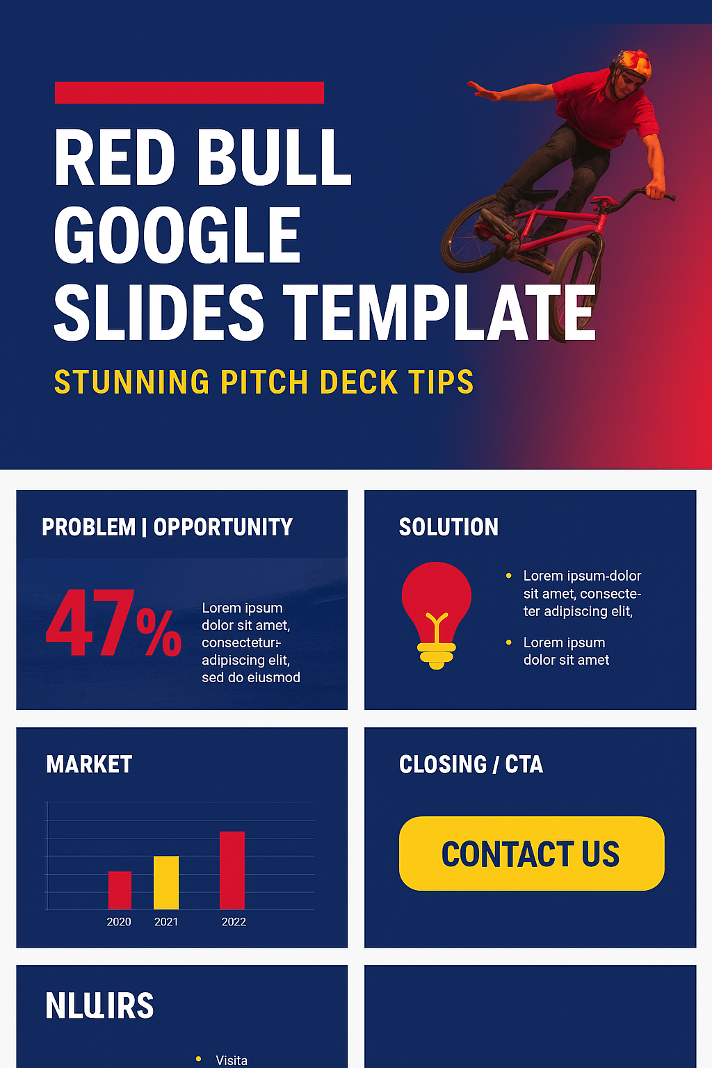
A proven 10–12 slide flow
Use this sequence as your backbone; copy prompts help you write quickly.
-
Cover / Hook — (6–12 words): bold headline + one-liner value prop. Use large hero image.
Example prompt: “Fueling performance: a high-octane sponsorship concept.” -
Problem / Insight — 2–3 bullets + one standout stat or visual.
-
Solution / Concept — 3 benefit bullets; one concept visual.
-
Offer / Activation — packages or tiers; quick comparison table.
-
Audience / Market — 1 map or 2 charts: reach + engagement.
-
Proof / Case Studies — short testimonial + metrics or partner logos (use permissioned logos only).
-
Creative Mockups — sample activations: arena takeover, product sampling, social clips.
-
Timeline / GTM — 6–12 month milestones; use a simple horizontal timeline.
-
Numbers / Ask — concise financials: revenue assumptions and the ask. Highlight the single number you want people to remember.
-
Team — 3–4 key bios; one-line credibility bullets.
-
Close / CTA — single next-step ask; contact details.
-
Appendix / Backup — extra data, charts, legal notes.
For each Red Bull Google Slides template, keep copy short and label data points directly on charts for clarity.
Comparison Table
| Slide # | Slide Title | Purpose | Key Content & Visuals | Pro Design Tips |
|---|---|---|---|---|
| 1 | Cover / Hook | Grab attention instantly and set the tone | – Big, bold headline (6–12 words) – Striking hero image – Tagline or one-liner value proposition |
Use high-energy imagery, Red Bull-inspired colors, and minimal text for impact |
| 2 | Problem / Insight | Show why your audience should care | – 2–3 short bullets – 1 shocking stat – Relevant background image or subtle gradient overlay |
Keep it visual — avoid walls of text; highlight one key stat in yellow |
| 3 | Solution / Concept | Present your big idea clearly | – 3 main benefit bullets – One concept mockup or illustration – Optional tagline |
Use a clean layout; emphasize benefits with icons and vibrant colors |
| 4 | Offer / Activation | Showcase what you’re proposing | – Features or package tiers – Comparison table or product visual – Activation concepts |
Use red/yellow highlights for CTAs; ensure package info is easily scannable |
| 5 | Audience / Market | Prove there’s demand | – Audience demographics – Market size & engagement charts – Target personas |
Use two contrasting colors for charts (deep blue vs yellow) for clarity |
| 6 | Proof / Case Studies | Build credibility and trust | – Short success stories – Partner logos or metrics – Before/after visuals |
Use circular logos for a modern aesthetic; avoid low-res partner logos |
| 7 | Creative Mockups | Make the concept come alive | – High-res mockups – Product/event activation visuals – Lifestyle imagery |
Overlay Red Bull-inspired gradients to unify mixed photos |
| 8 | Timeline / GTM Plan | Show your execution roadmap | – Horizontal timeline – Key milestones (3–5 points) – Icons for each phase |
Use yellow accent dots or arrows to guide the viewer’s eye |
| 9 | Numbers / Ask | Share financials and key metrics | – Revenue projections – ROI stats – “The Ask” (investment, sponsorship, etc.) |
Use one highlighted metric in bold yellow for emphasis; keep charts simple |
| 10 | Team | Humanize your pitch | – Key team members – Short bios (1–2 lines each) – Expertise highlights |
Use uniform headshots with circular crops for a clean, premium feel |
| 11 | Closing / CTA | End strong and direct | – Single, clear next-step CTA – Contact details – Simple, striking visual |
Use a bold yellow button-style CTA; keep the slide uncluttered |
| 12 | Appendix / Backup | Provide supporting data and extras | – Additional charts or case studies – Legal notes – References |
Keep appendix slides visually consistent but less busy than main slides |
Signature colors + exact hex values
To capture the Red Bull aesthetic without using the logo, use these tested color values as your palette:
-
Crimson/Primary Red:
#EC1845or#CC1E4A. -
Cyber/Accent Yellow:
#FED502/#FFC906. -
Deep Navy/Accent Blue:
#003773/#000B8D. -
Neutrals: white
#FFFFFFand medium gray for body copy.
Use the red for strong headlines and hero elements, the yellow for CTAs and emphasis, and navy for large backgrounds or charts. Always test contrast for readability (large red blocks + small white text can be hard to read on some projectors).
Typography:
Choose Google Fonts that match the feel but remain web-safe for Slides:
-
Headline font (bold, condensed): Oswald, Montserrat Alternates, or Anton for punchy impact.
-
Body font (readable at small sizes): Roboto, Inter, or Lato.
Keep headline sizes large (32–48pt depending on room size) and body text 18–22pt to ensure legibility in a live room. Avoid decorative fonts that reduce clarity.
Imagery and photo treatment
Pick high-resolution, action-oriented photos: athletes, motorsport close-ups, crowds, urban lifestyle, or dynamic product shots. Treatments that unify images:
-
Duotone overlays using your red/yellow pair.
-
Gradient overlays (navy → transparent) to keep text readable.
-
Dramatic crops and motion-blur effects to suggest movement.
Always use client-owned or licensed stock photography; don’t lift promotional images from another brand’s site without permission. Slides with full-bleed imagery and a single short headline often outperform text-heavy slides.
Data visualization
-
- Export as PDF → Ensures consistent formatting and avoids layout issues when emailing your pitch deck.
- Use 16:9 Aspect Ratio → Ideal for modern screens and projectors; prepare a 4:3 version if needed for older setups.
- Optimize for Printing → Replace heavy gradients with flat Red Bull-inspired colors for better CMYK print quality.
- Share Both Formats → Provide a PDF copy for easy viewing and a Google Slides link for live presentations.
- Check Embedded Media → Test videos, animations, and fonts to ensure they work seamlessly when shared or viewed offline.
- Run a Final Test → Open your exported deck on multiple devices and projectors to confirm colors, visuals, and layout accuracy.
Brand and legal quick checklist
Before you drop an official logo into a deck, read the brand rules. Red Bull’s partner/production portals and official style resources explain permitted use for logos, color systems, and production specs — and they matter if your presentation is commercial or public-facing. General rules: avoid using the Red Bull logo or trademarked lockups unless you have explicit permission; instead, use the color palette, tone, and photography style to evoke the brand energy. When in doubt, swap in your client’s logo or a neutral wordmark.
Closing
A red bull google slides template can transform a tidy pitch into something that feels alive — fast, confident, and memorable — so long as you respect brand IP, use clear data visuals, and design for the room. Take a strong starter template, apply the palette and typographic rules above, swap in action photos, and rehearse once. That’s the simple recipe for slides that actually give your message wings.